Figuring out what kind of data you have, plus information about how to visualize the different types
Different ways to symbolize data
This guide helps you:
- Differentiate between qualitative (categorical) and quantitative data in GIS.
- Identify attribute data that can be visualized beyond simple location mapping.
Visualizing more than just the location of your data
If you’re just mapping the locations of your data, take a look at Best practices for map-making.
Your data is more than just places on a map. Most likely your data has additional attributes associated with it which you can visualize in different ways. These attributes can be qualitative attributes (e.g. bird species, paving material, which language is spoken) or quantitative attributes (e.g. total bird observations, path width, number of speakers of a particular language). Open your data table (known as attribute table) in a GIS software to determine which attribute(s) you want to represent on your map.
Qualitative data are attributes that are typically non-numerical. Qualitative data is sometimes referred to in mapping as categorical data. You can use different point or line colors or symbols, or different polygon fill colors or patterns, to represent different attributes.
Quantitative data are attributes that are numerical. There are a number of data classification methods available to choose from. Selecting the right data classification method depends on the data you want to map.
You can use filtering with both qualitative and quantitative data. Filtering your data can allow you to develop a better understanding of what your data looks like, which can help you choose how many and what classes you want to use.
Choose the number of classes
A consideration for mapping both qualitative and quantitative data is to think about the number of classes you will map. A good rule of thumb is no more than eight classes. Using between 4-6 classes works best and prevents a user from having to constantly refer back to the legend or trying to distinguish between 9 different shades of red. Sometimes a simple two classification scheme works best (e.g. total population living above or below the poverty line),
Mapping Qualitative Data
To help the map reader understand information about your map at a glance, assign a symbol or color to represent a particular attribute value (such as using an airplane icon to represent airports vs. a gas pump icon for gas stations; or using different fill colors for county election results, etc.)
Mapping Quantitative data
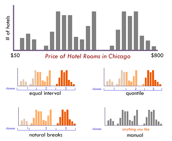
Natural breaks
A data classification technique which groups together similar values while also maximizing the differences between classes.
Equal intervals
A classification method which divides the total range of data attribute values into equal sized sub ranges or bins
Quantile Classification
Divides data where each data class contains an equal number of features. (Ex: 100 counties in 5 classes, exactly 20 counties would go into each color category)
Manual Classification
A technique where you define your own custom class breaks or intervals without relying on the automated classification statistical methods. A good method before using manual classification is to try the other statistical methods mentioned above to see what you get.
Note: while this method offers you full control over your map’s visual representation, avoid creating a large number of breaks - too many breaks (colors) can make a map messy and hard to read.
Did you know?
It’s possible to represent relative amounts of two attributes at once (e.g. diabetes and obesity levels) by using bivariate symbolization. Each attribute would be represented by a different color, which are blended to varying degrees based on relative prominence. Darker shades would typically represent features that had high values of one or both attributes.
Resources
- Classification and Clustering
- GIS: The Exploration and Exploitation Tool
- What are the Mapping Classification Methods?
- The Basics of Data Classification
Need Help?
If you have questions or need assistance, please contact us!